Cohesity Rebrand
Evolution of the Cohesity brand to a more modern visual system that reflects relentless innovation in cybersecurity.
Challenge
Cohesity serves IT teams facing increasingly sophisticated threats. The brand needed to communicate urgency, trust, and momentum while reassuring customers who never get to rest.
Approach
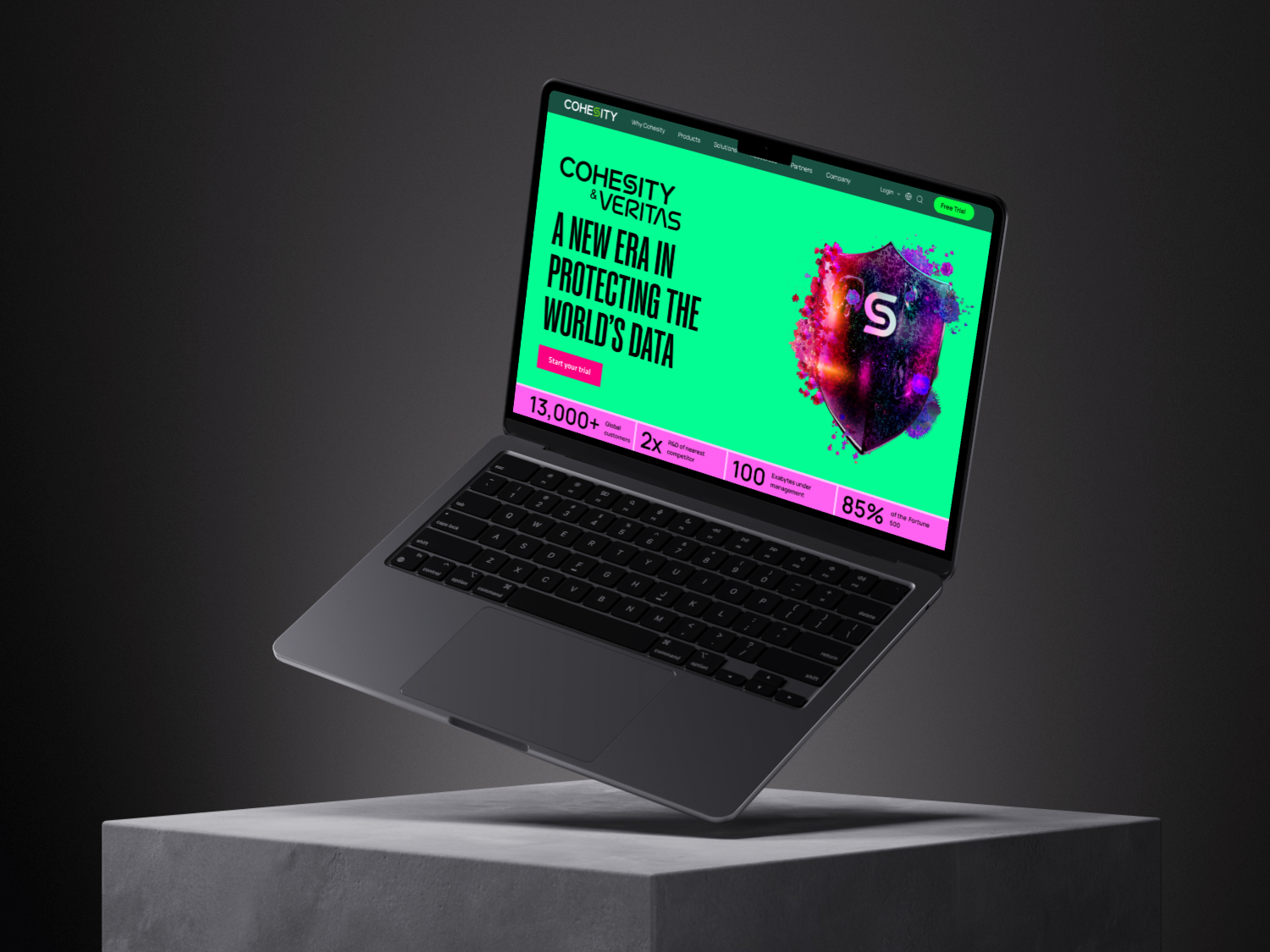
Led extensive color palette exploration, conducting thorough research across RGB and CMYK color spaces, print testing, and A/B testing to ensure optimal color performance across digital and print applications. Contributed to the brand rebrand, including typography and visual identity systems, while leading the web redesign from concept through execution to deliver a modern, cohesive digital experience.
Outcome
A sharper, more modern brand system that strengthens Cohesity's narrative of shrinking threats and growing opportunities across the industry.
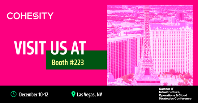
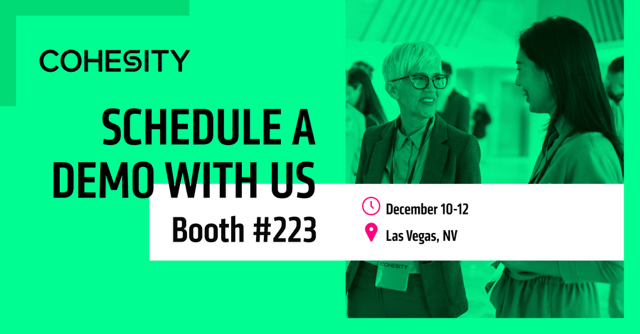
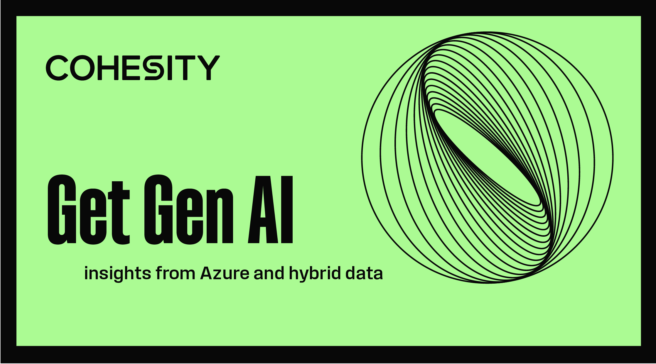
Gallery
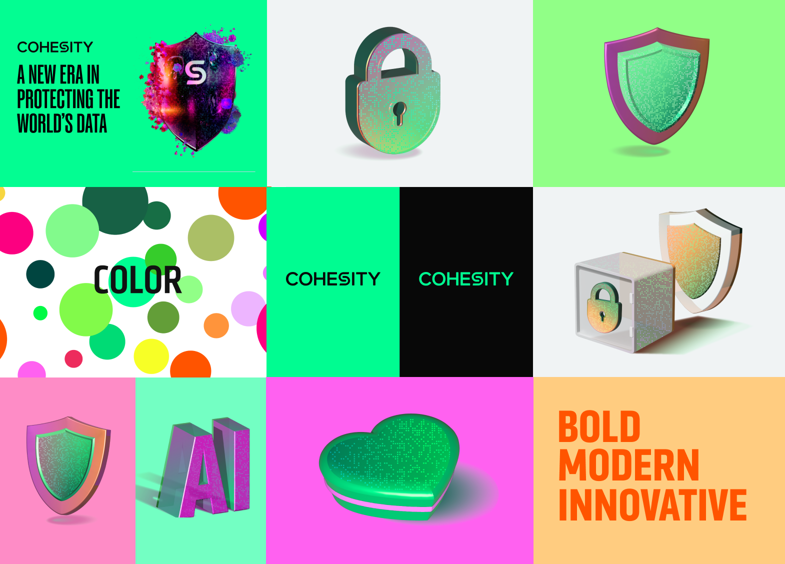
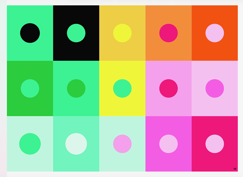
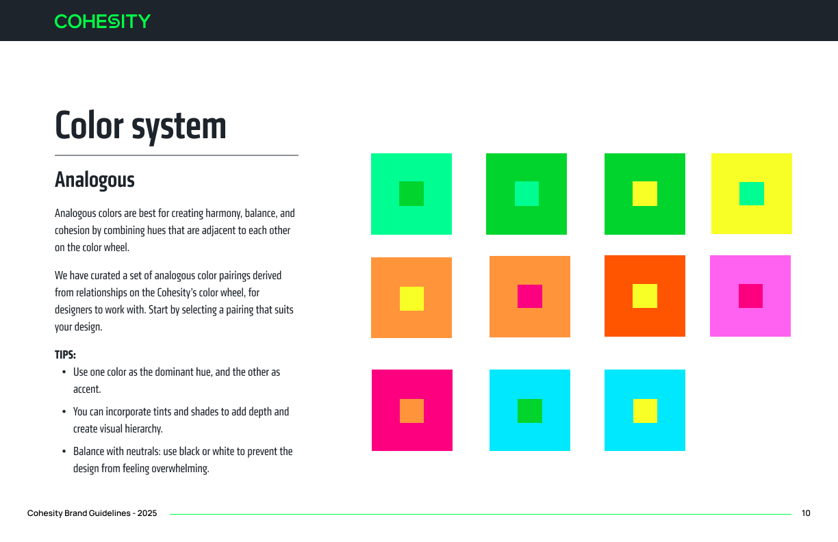
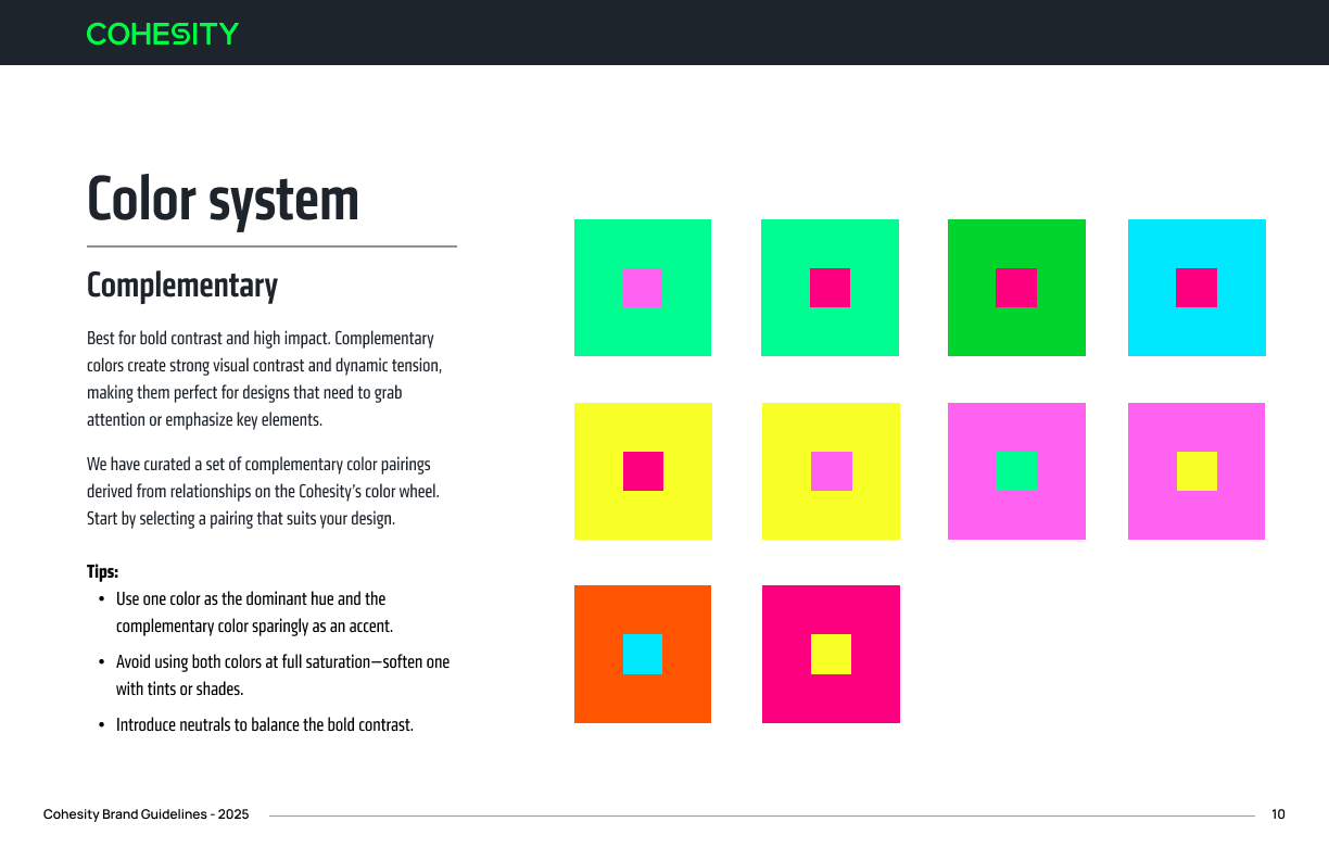
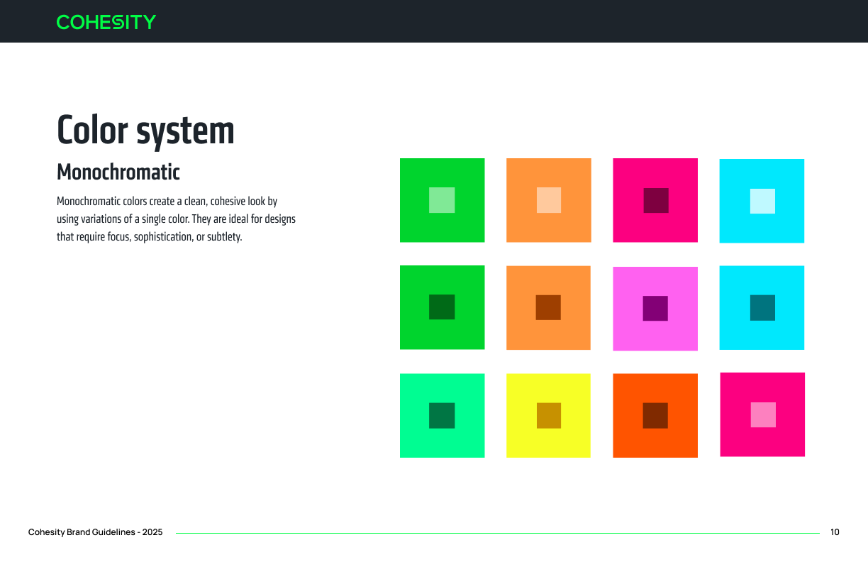
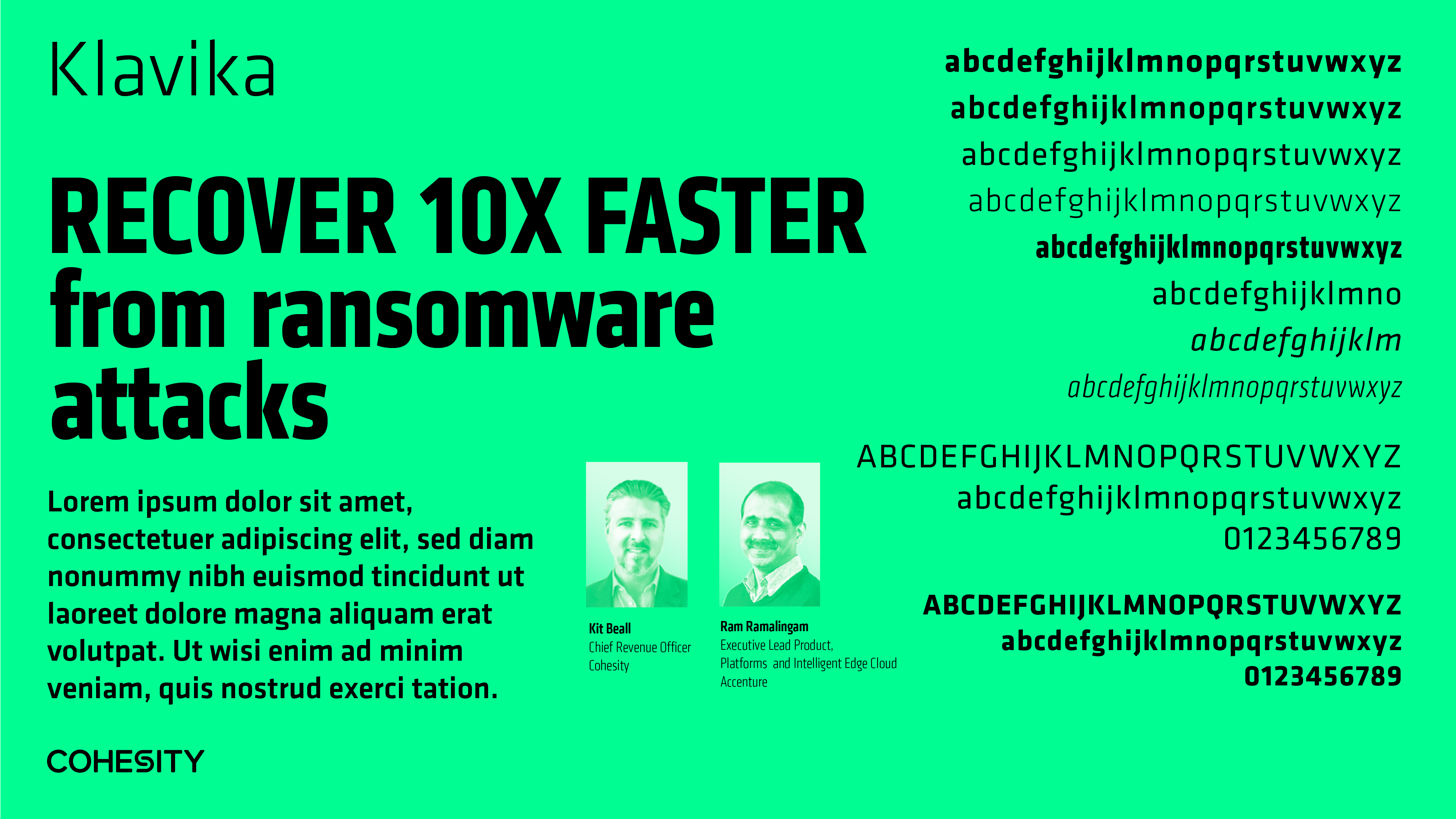
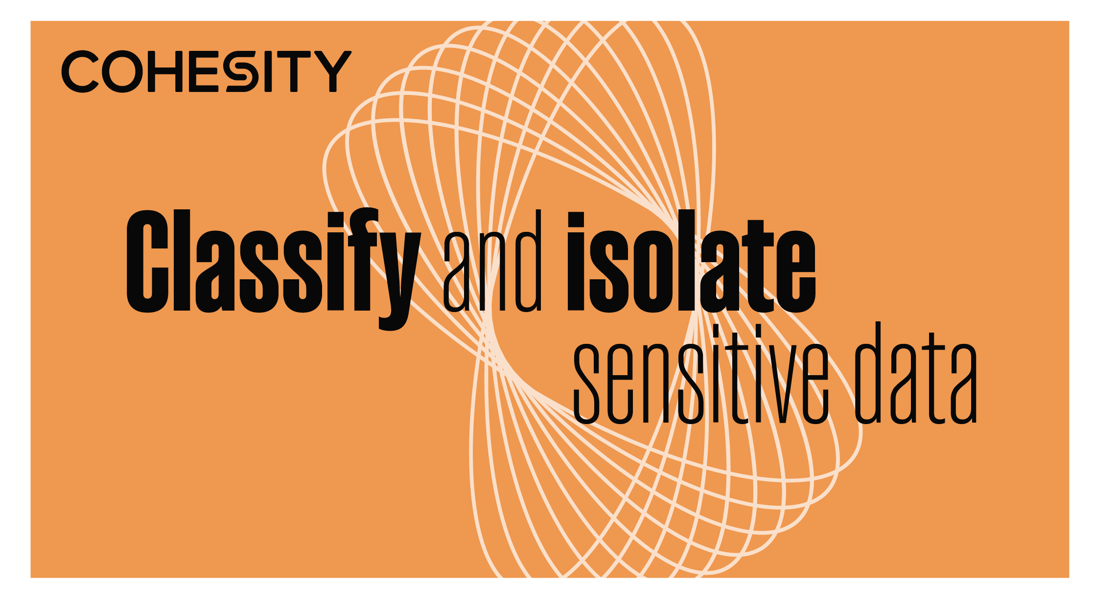
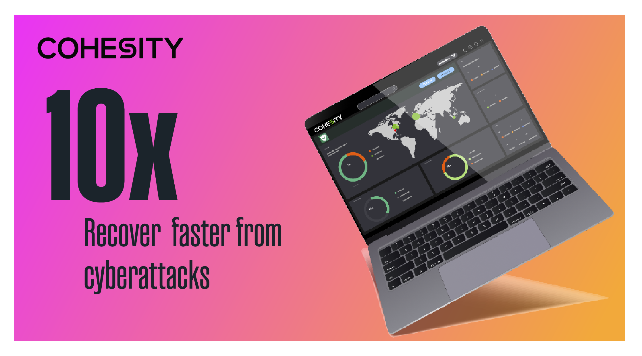
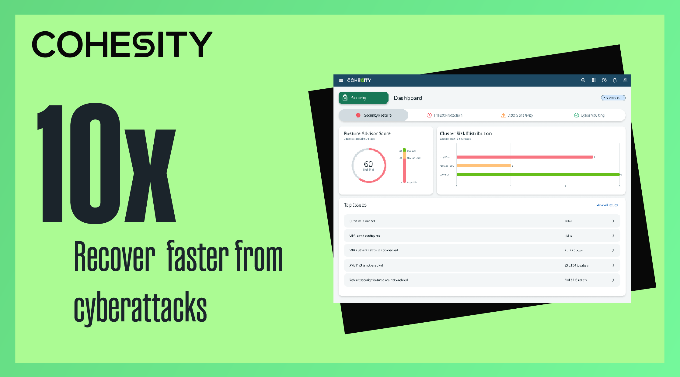
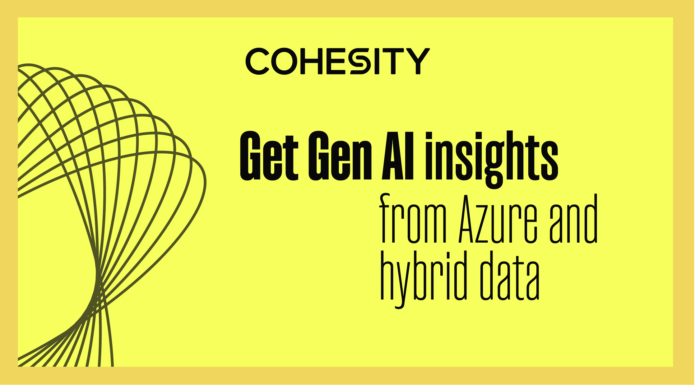
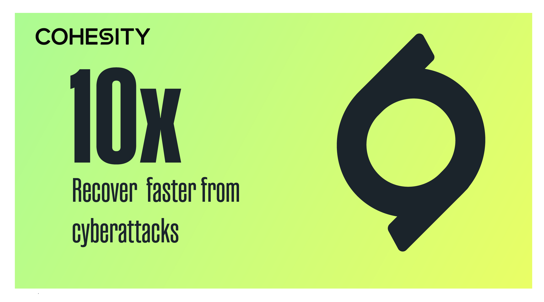
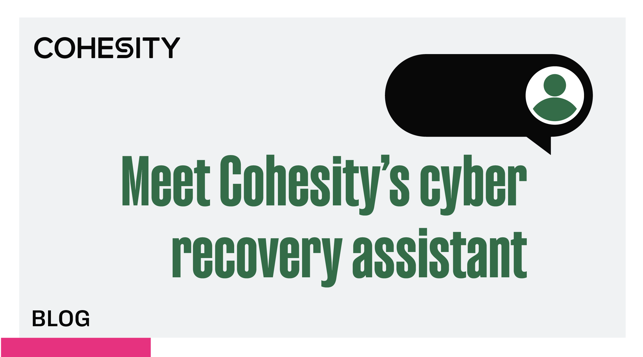
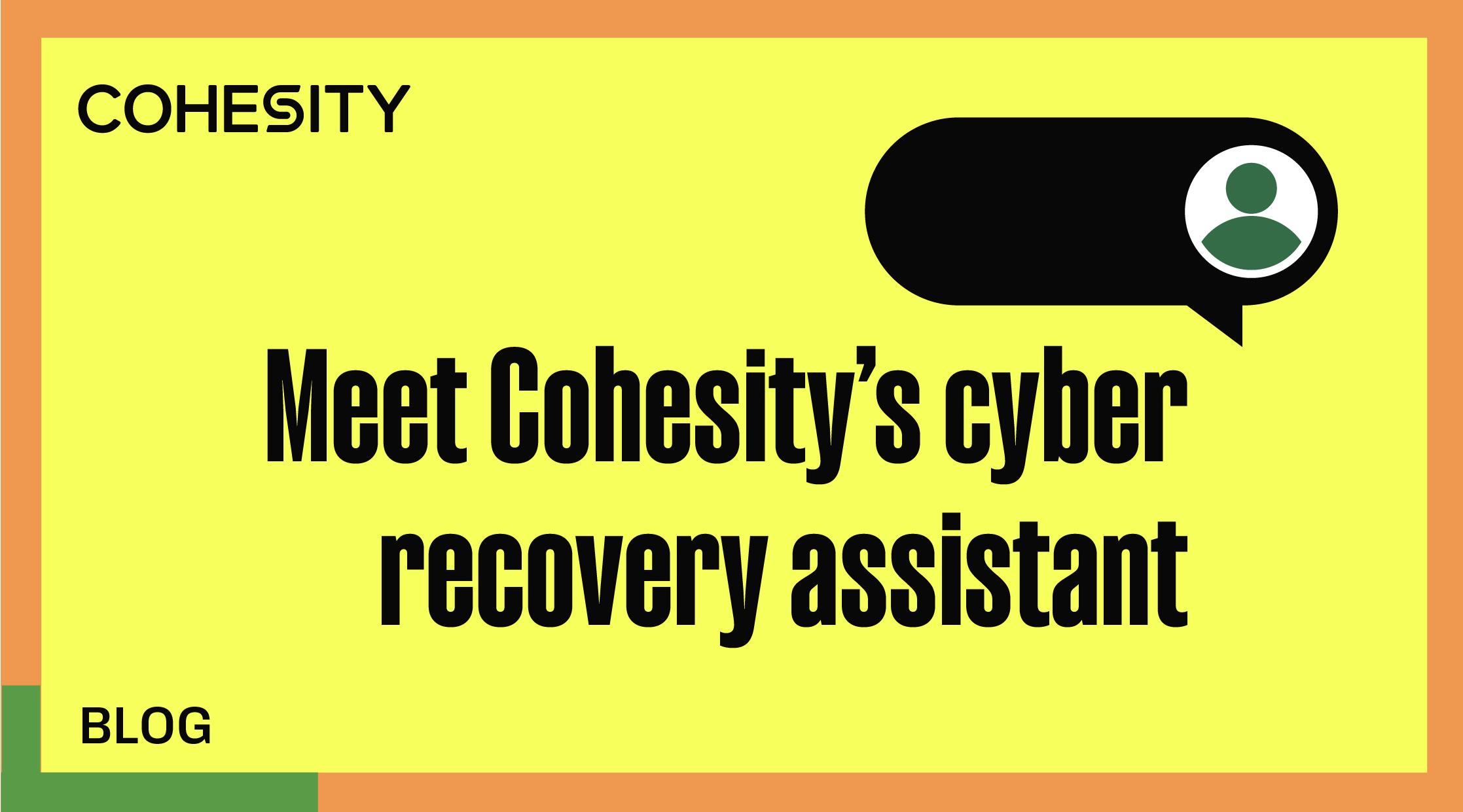
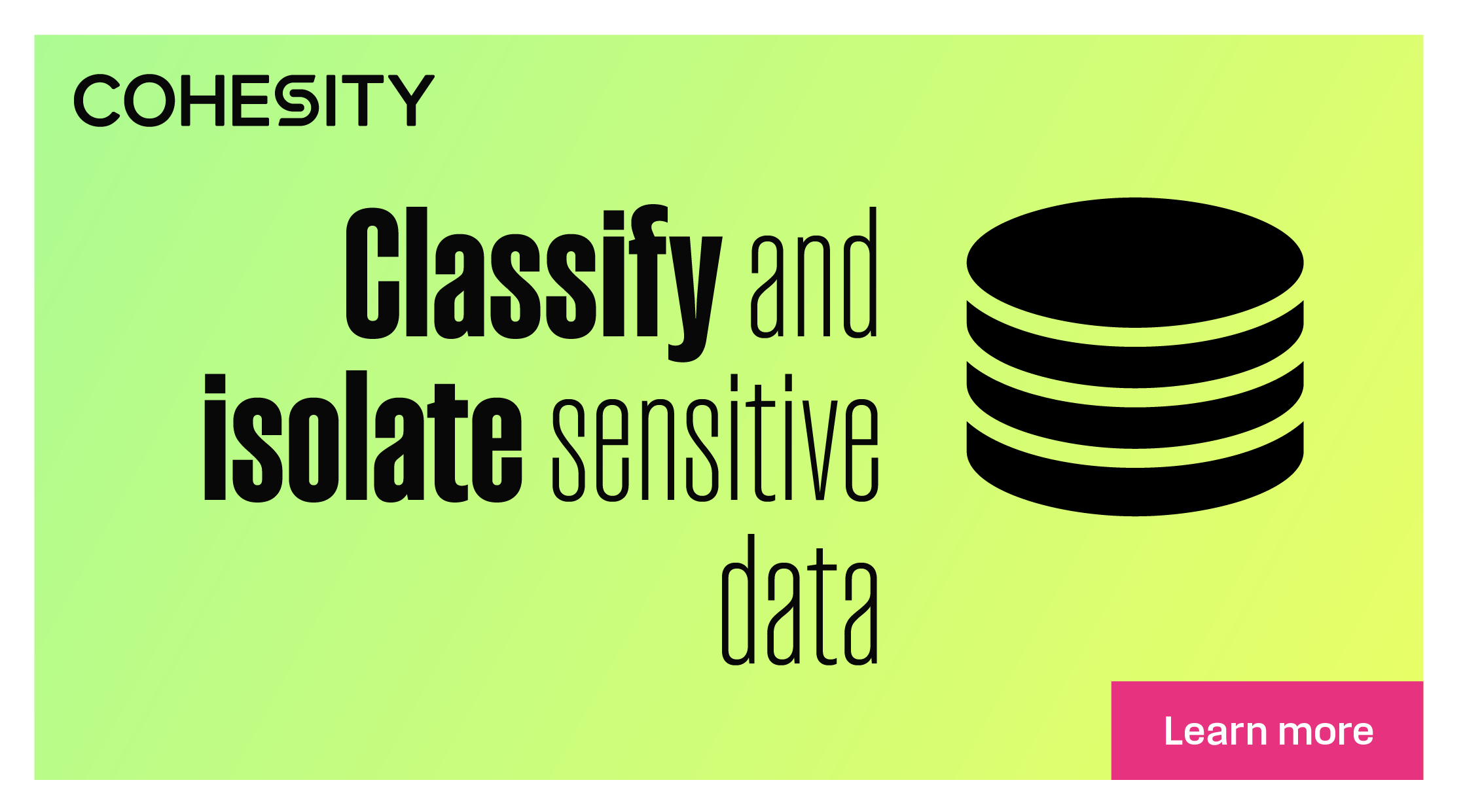
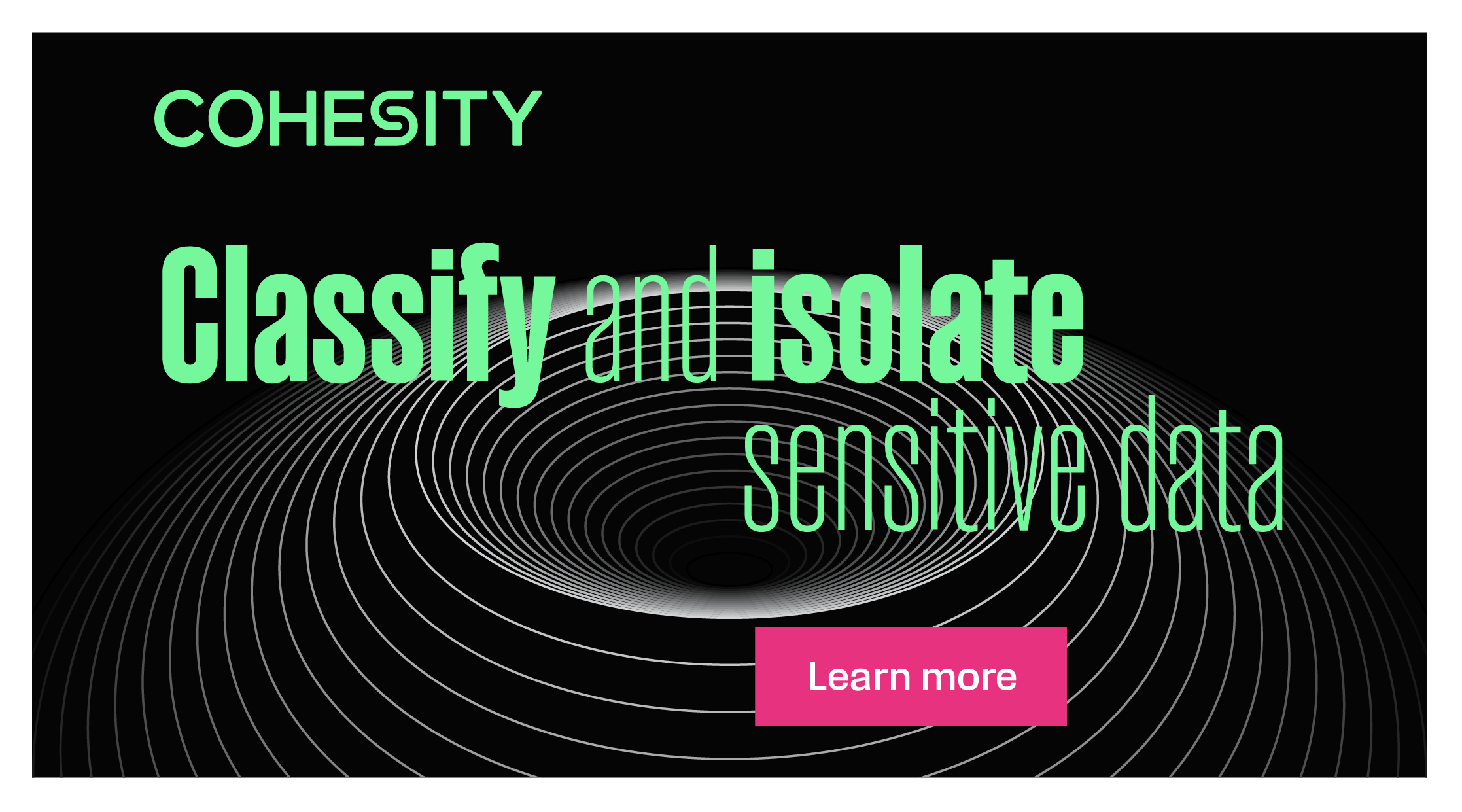
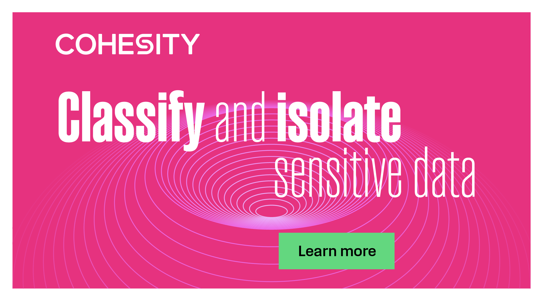
Color Palette Exploration
Led an extensive color palette exploration to ensure optimal color performance across both digital and print applications. The process involved thorough research and testing across RGB and CMYK color spaces, evaluating how colors translate between digital screens and physical print materials. Conducted comprehensive print testing to verify color accuracy, consistency, and vibrancy across various substrates and printing methods. Performed A/B testing to validate color choices against brand objectives, user perception, and accessibility standards. This rigorous approach ensured the final color system maintains visual integrity and brand impact whether viewed on screen or in print.


Typography & Brand Elements
Refined the typography system with careful attention to font stress, weight variations, and character spacing, while developing a comprehensive set of brand elements that work cohesively across various applications, ensuring visual consistency and brand recognition.


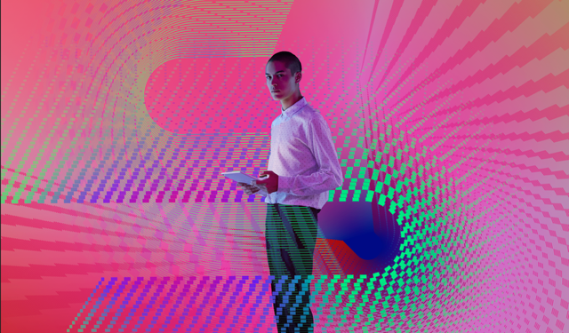
Brand Exploration
Early exploration and concept development that informed the final brand direction, exploring various visual approaches and design directions.

Related Projects
The rebrand visual system extended into a company-wide design system and the Cohesity website—codifying tokens and components, then scaling them across product and marketing.
Cohesity Design System
A scalable design system that codified the Cohesity rebrand into tokens, components, and patterns for product and marketing teams.
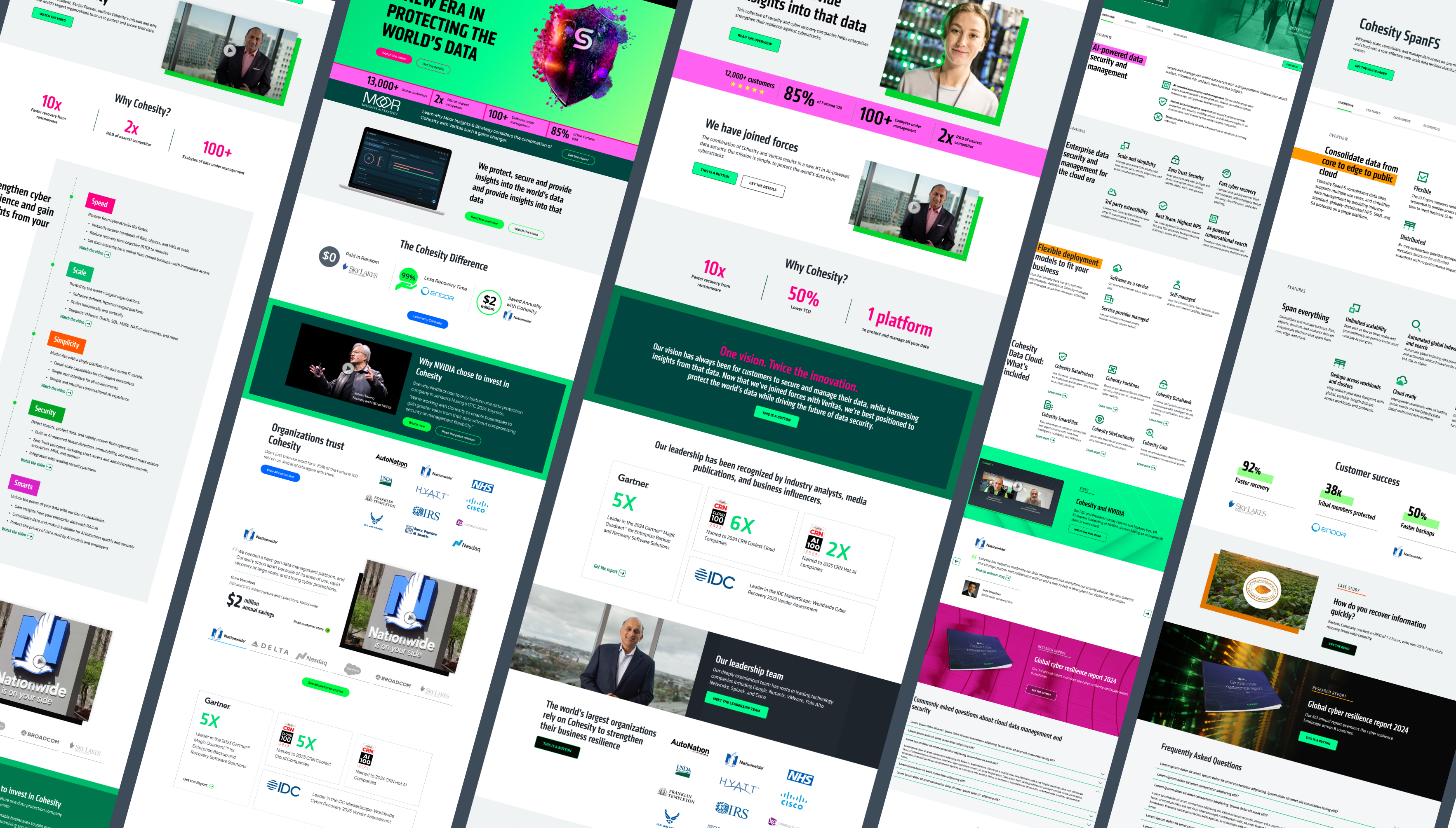
Cohesity Website Redesign 2025
A large-scale website redesign delivered in phases, starting with the launch of 170+ pages in Phase 1. The work involved close collaboration across web, marketing, PMM, and design teams, with the launch celebrated across the company. The project included building a flexible template system across Product, Solution, Resources, Demo, and other page types. Over three quarters, the redesign expanded to 500+ pages, resulting in a modern, cohesive digital experience that supports brand evolution, campaigns, and enterprise messaging.